USA for UNHCR
At USA for UNHCR, we used data all the time; we generate reports, we draw things, we sketch our ideas. The action to bring abstract relations and concepts to life help us:
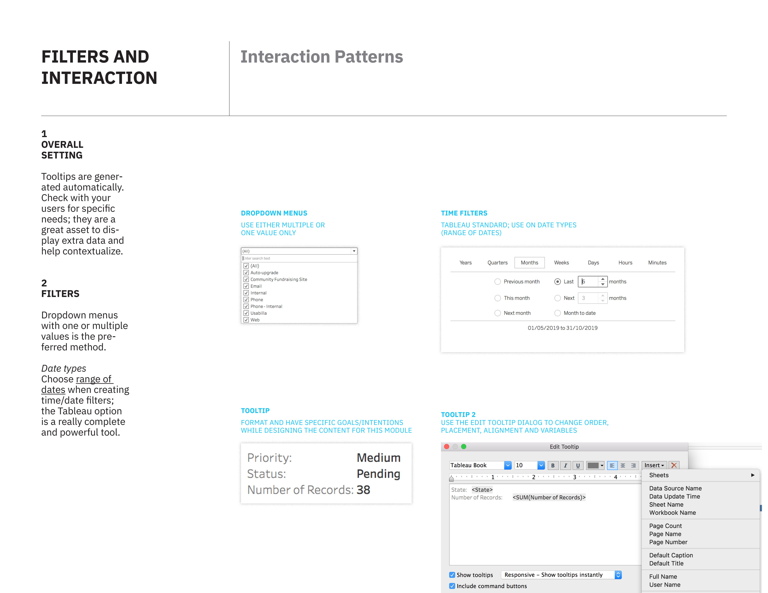
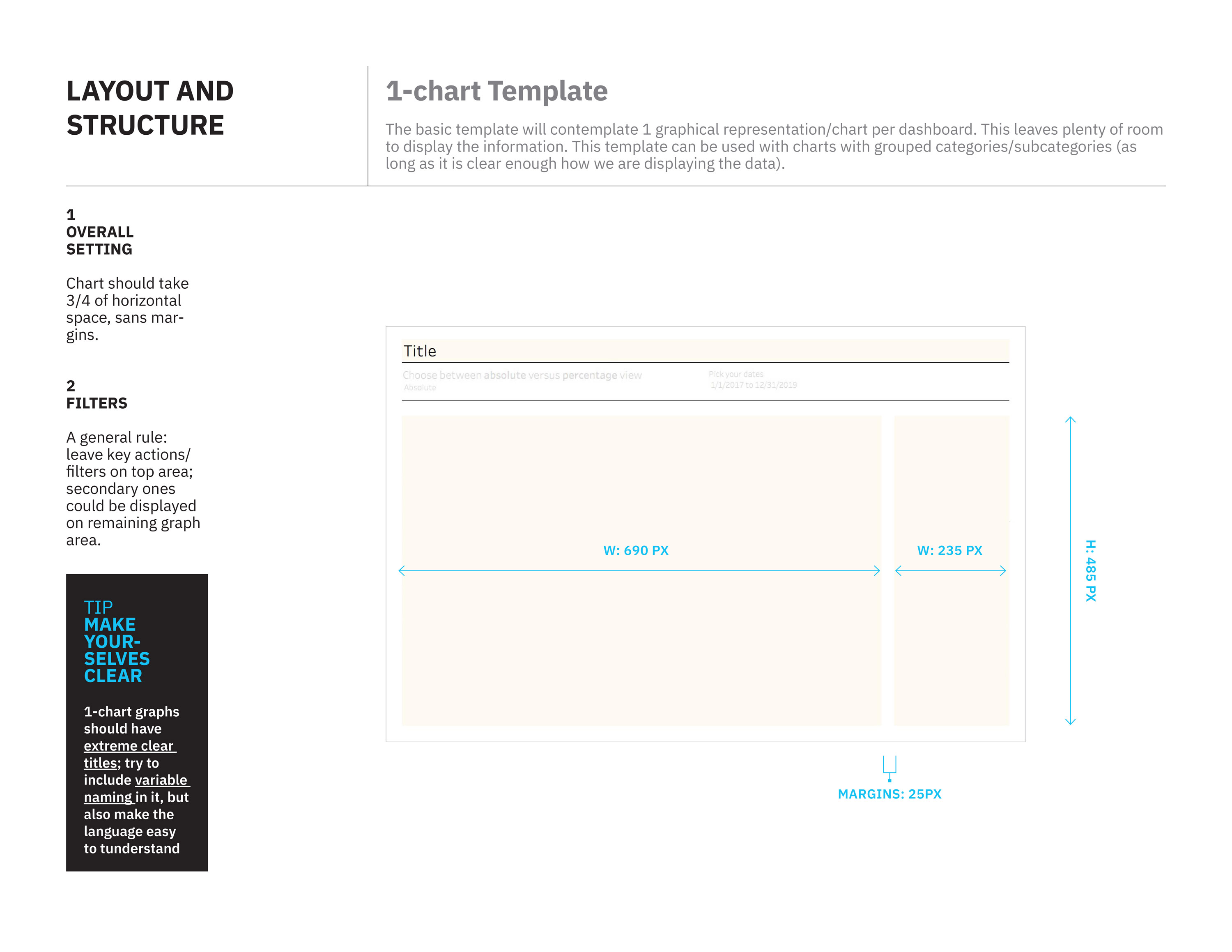
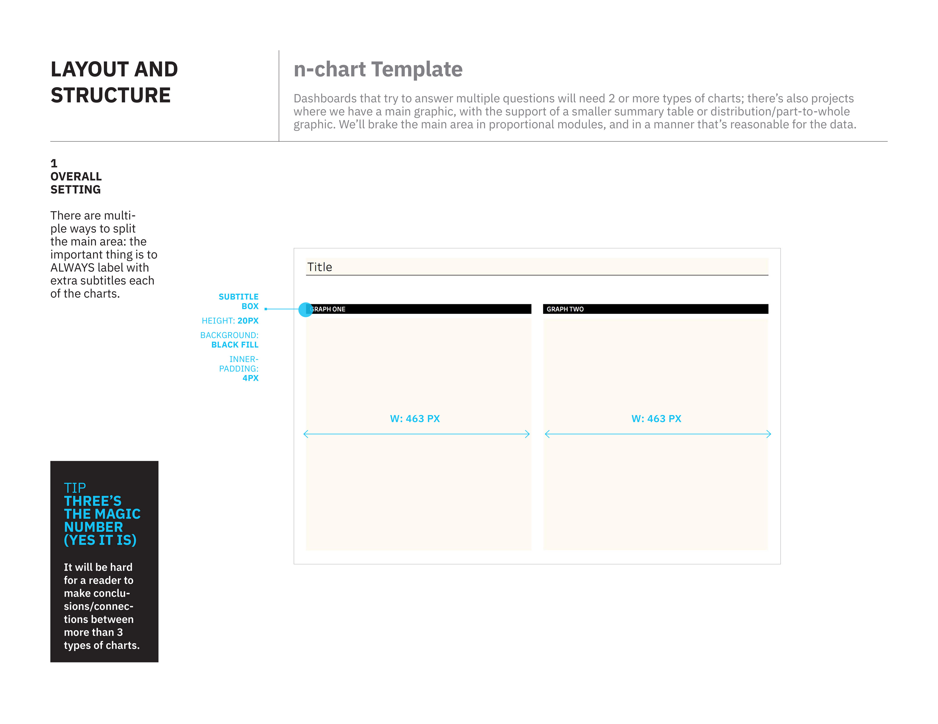
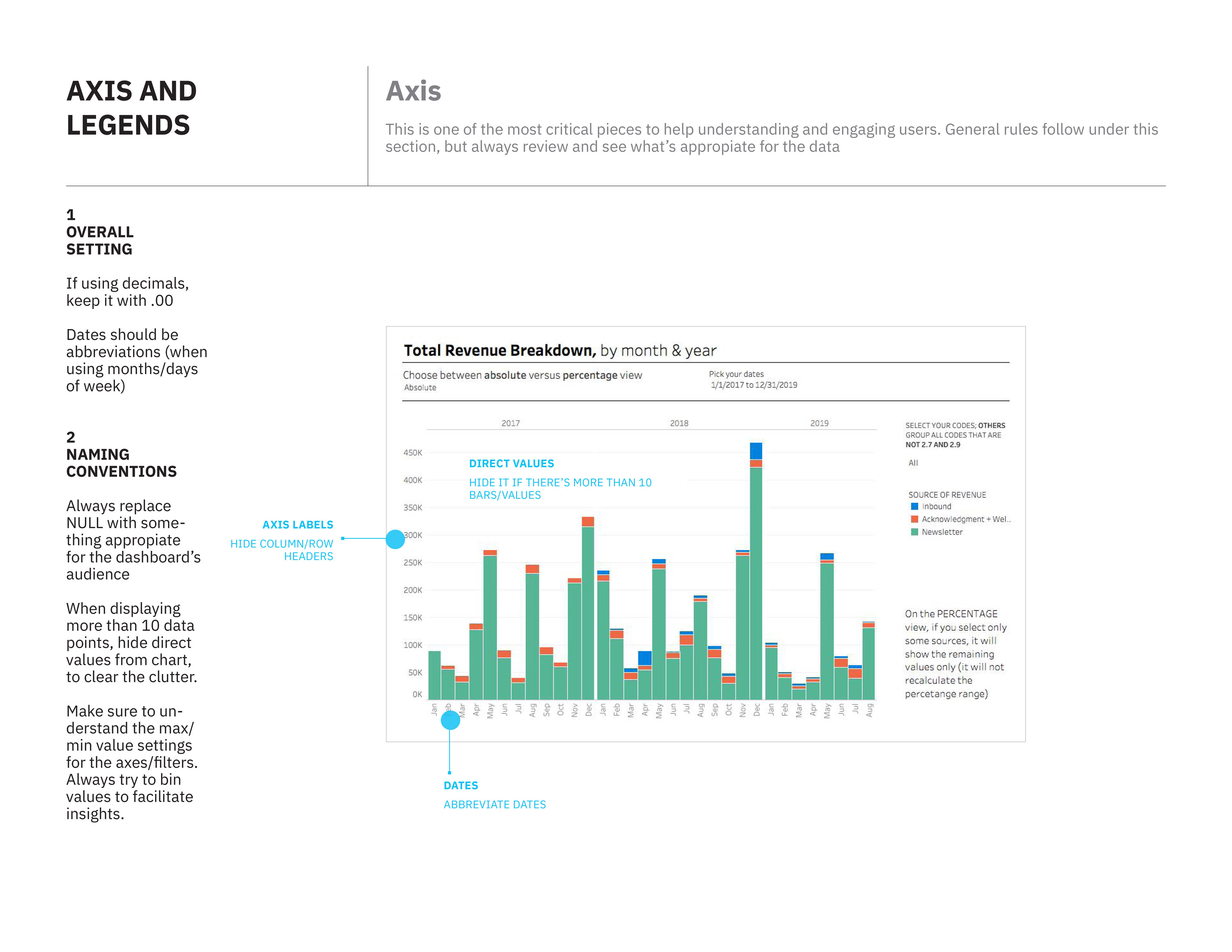
Data visualization aims to give its readers and audiences a chance to understand data in a way that enhances our cognitive skills; since we have a vast number of data sources, the idea is to help teams internally with automated dashboards, published on our Civis hosting platform using Tableau.
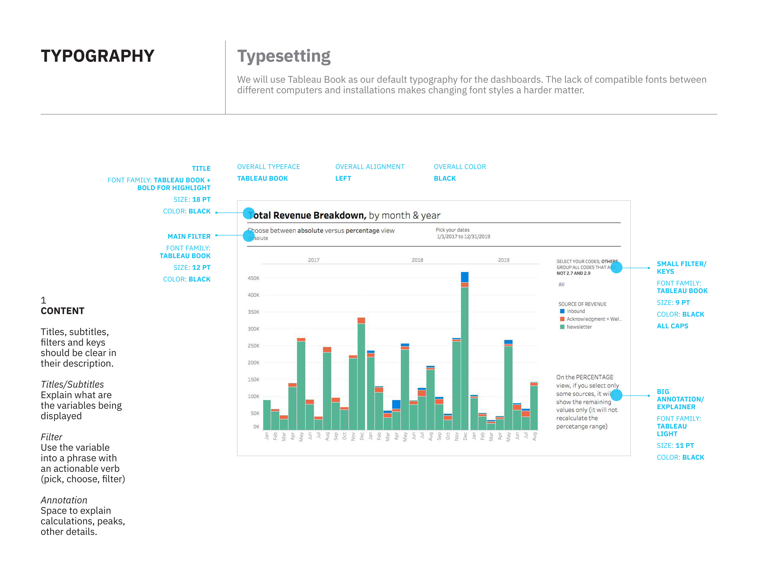
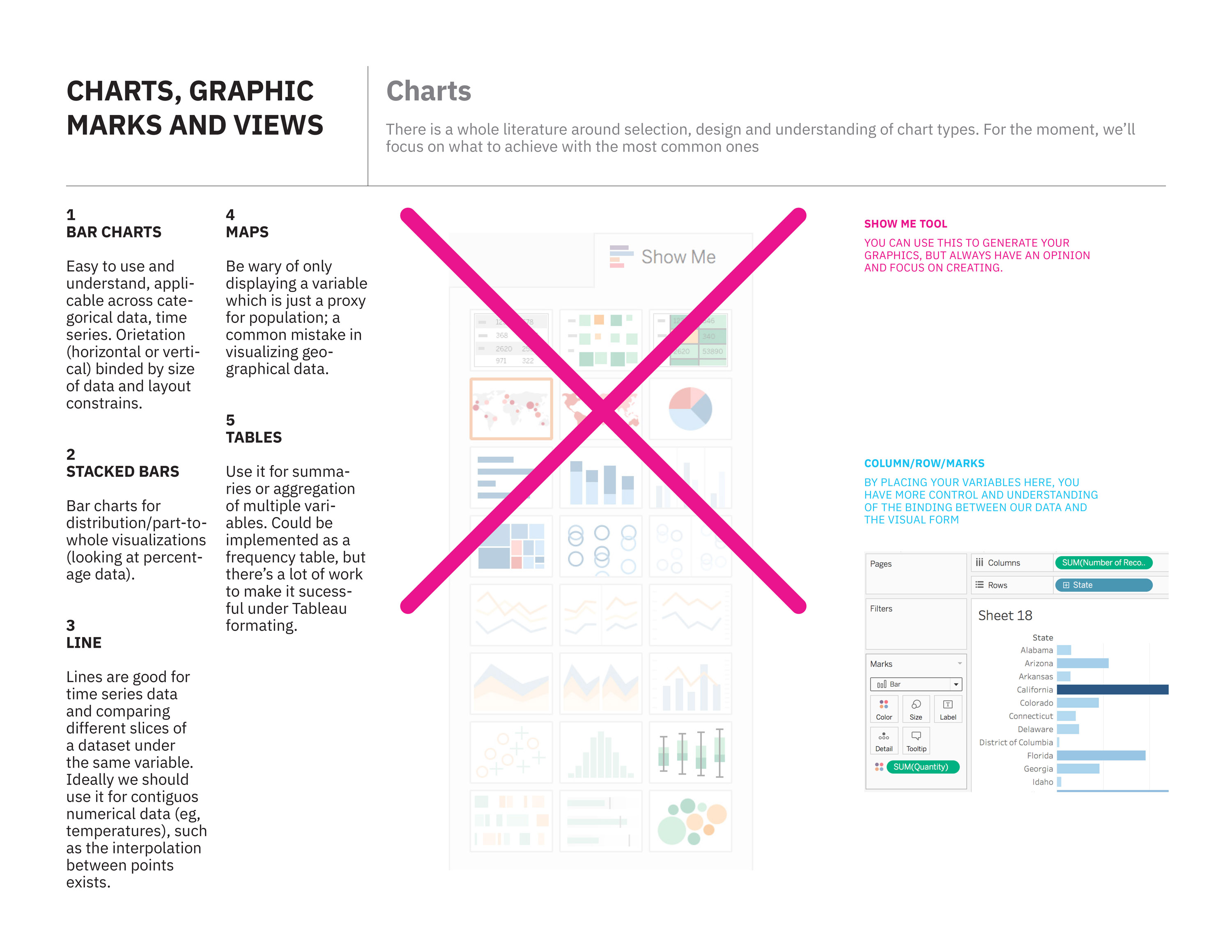
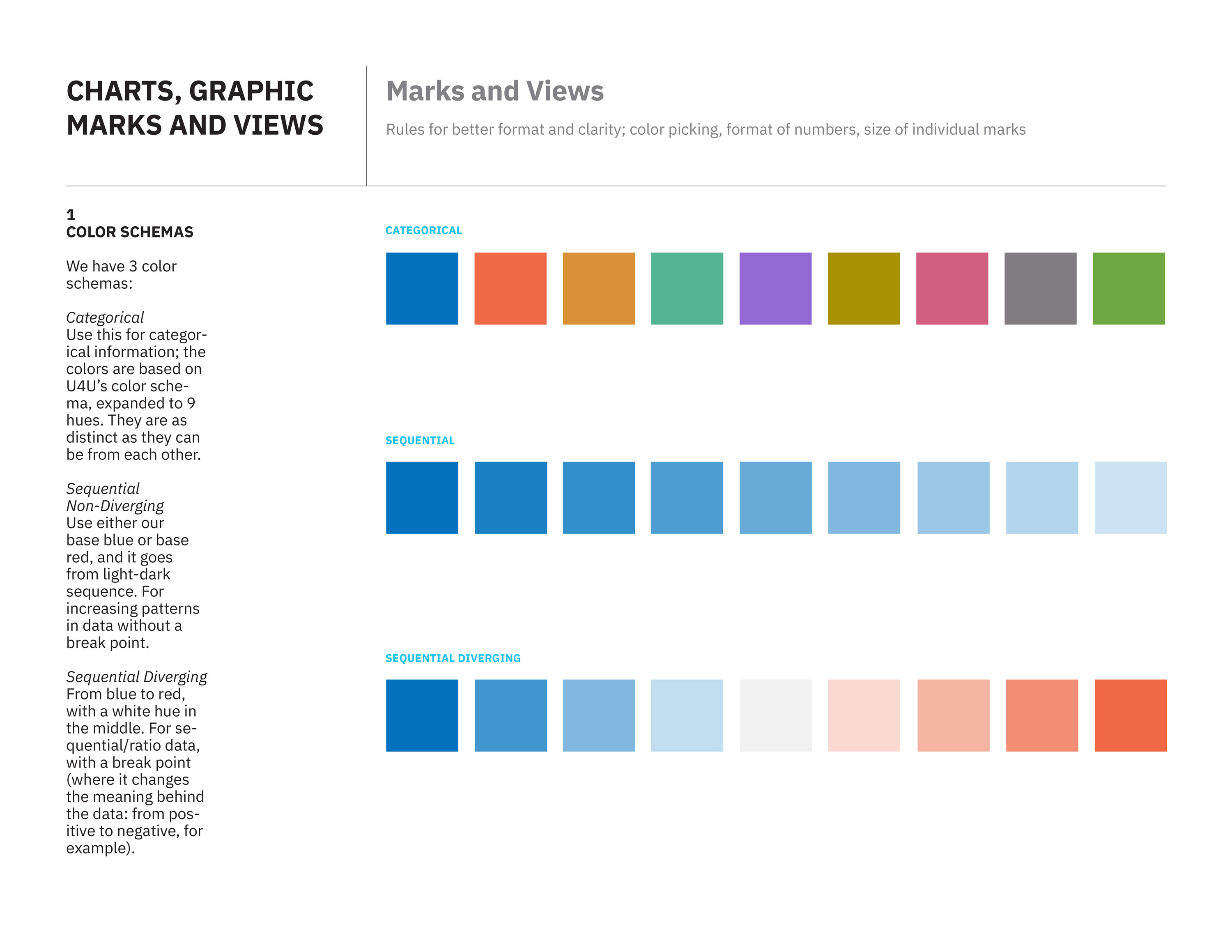
I’ve worked on a series of template and visual guidelines for Tableau for our team, The Hive. The main goal is to achieve visual harmony between multiple reports, clear definitions on naming and interactive conventions, while maintaining the look and feel of the organization.